Today’s blog is about interface design, foolish tech optimism, and the horror of reality. Reality–not great! Some good stuff. But social networks want you to log on a feel good! Smash that like button! Click the heart! They tend to prioritize positivity by design.
The other day I saw a journalist post a story about an atrocity, and my broken brain noticed something peculiar, unrelated to the story itself.
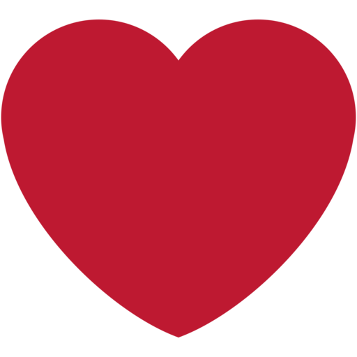
At the time, the post had been retweeted much more than ‘liked’ or favorited or hearted; that’s sort of a rare thing on Twitter, when clicking the heart button is the less significant action. Popular posts tend to be ‘hearted’ a zillion times but retweeted less, because retweeting commits a post to your feed, as though you’re saying the same thing. But not a lot of people were ‘liking’ this story about Native American’s struggling with the government shutdown. Because it’s not a fun topic to like! (The ratio has since leveled off, which undermines my whole point, but bear with me.)
Social media platforms have designed this sort of positivity into their interfaces. I’ve noticed the same thing on Medium (disclosure… a company I do contract work for). On that platform, you can “clap” for an article to show that you read it or you care about it. People click “clap” if they like something. But if you publish some ugly truth–maybe a deep dive into the Rohingya genocide, for example–positive reinforcement feels a little strange. Feels weird to clap for genocide even if you’re trying to express support for the work. More notoriously, a couple years ago Twitter changed their ambiguous ‘star’ button into a heart. That was particularly annoying because a heart is more loaded than even clicking ‘like’; you might recognize something as being important without wanting to blast a Valentine’s Day card at it.
This is all to say that most platforms, in trying to foster positive discourse, inherently discourage engagement with things that are not nice, even if they are important.
Fewer likes, or faves or hearts or lucky charms, sometimes mean the article will be circulated less, depending on whatever algorithm is in charge. It’s basically a user interface challenge–how do you indicate your attention without also expressing a specific emotion?–but it affects the way BILLIONS of people share and consume information.
There’s room here for an aside about what you might call “inspiration porn”–a troop comes home and you won’t believe what happens next, a dog did something amazing when little Timmy yadda yadda, this whole town rallied around some idiot. Upworthy famously rise and fell trying to appeal to this quirk in the algorithm, but it’s still a spammy genre of Dumb Things You See on Facebook.
Of course Facebook diversified it’s responses to include cute illustrations that range from sad to mad to heart and the old fashioned like. Even so, clicking sad face emoji feels like a bizarre way to engage with difficult information. But I realize a neutral symbol wouldn’t really make sense either. I would not click uh… Ball… or Triangle… or whatever.
I don’t have a better way; it’s just something I was thinking about. Please like and subscribe!

Leave a comment